Watercolor beginners tend to do one of two things with color.
Either they buy a tiny student set and try to force twelve sad little pans to do everything… or they buy every gorgeous paint tube they see until they own seventy-three colors and still somehow can’t mix a decent green.
Both are part of the watercolor experience.
But learning to mix your own colors is one of the biggest turning points in watercolor. It’s the moment paintings stop looking stiff and start feeling alive.
Because real color is rarely straight from the tube.
Especially greens.
Let’s Talk About the Green Situation
Beginner watercolor sets are obsessed with giving people terrible greens.
Usually it’s some screaming bright “leaf green” that looks less like nature and more like a tennis ball that got emotionally overwhelmed.
The problem isn’t green paint itself. Convenience greens absolutely have their place. The problem is using them untouched.
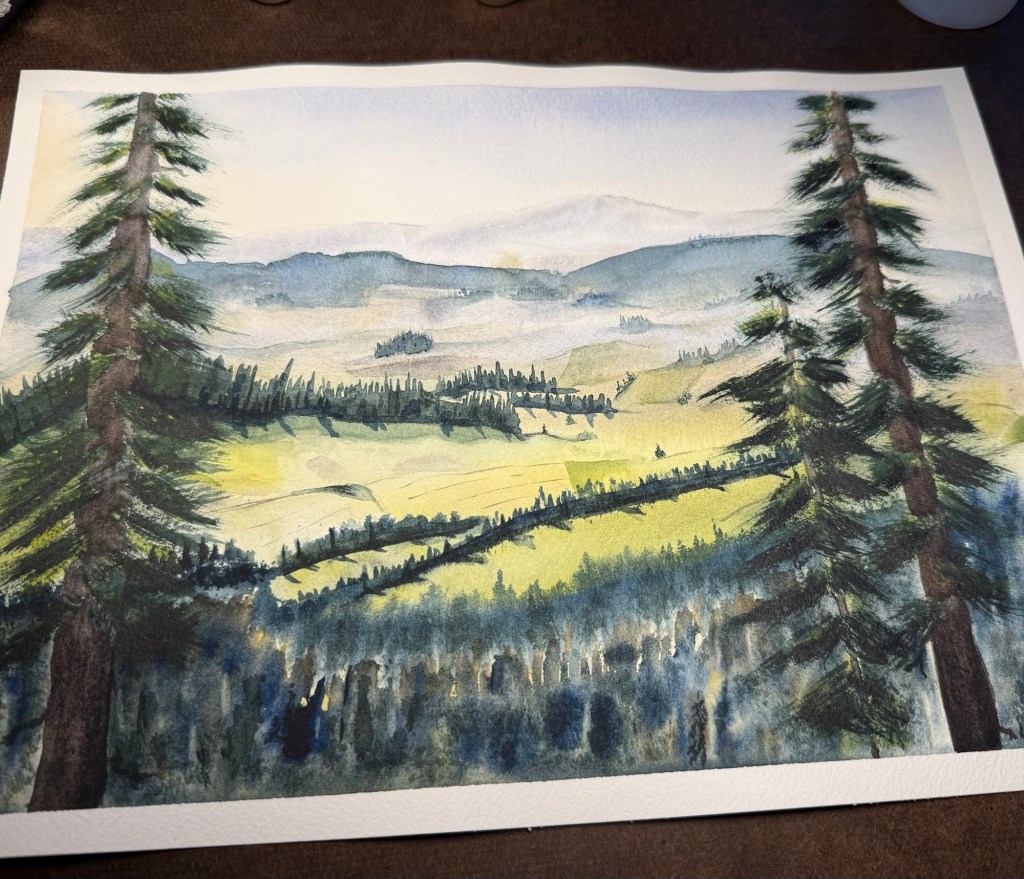
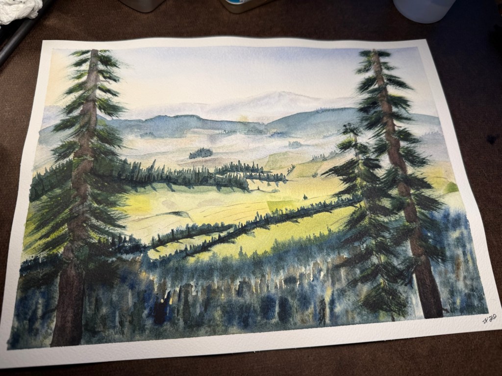
Nature has an absurd amount of variation in green. Sunlit grass is different from pine trees. Pine trees are different from moss. Moss is different from eucalyptus leaves. Distance changes green. Weather changes green. Shadows change green.
That’s why paintings made with a single tube green can end up looking flat fast.
Mixing your own greens gives you far more control.
A cool blue mixed with a cool yellow creates bright vivid greens:
- Phthalo Blue (Green Shade) + Azo Yellow
- Winsor Blue GS + Hansa Yellow Light
A warmer blue creates softer, more natural greens:
- Ultramarine Blue + Yellow Ochre
- Cobalt Blue + Raw Sienna
Those softer mixtures are usually what make landscapes feel believable.
And if a green is too loud? Neutralize it a little.
Burnt Sienna is excellent for this. A tiny touch can turn an artificial-looking green into something earthy and natural almost immediately.
Convenience Colors Are Fine
There’s a strange attitude in some watercolor circles that using convenience colors is somehow “cheating.”
No.
If a color works, it works.
Sap Green, Undersea Green, Cascade Green, Green Apatite Genuine — these can all be beautiful paints. The key is understanding what they do instead of treating them like magic solutions.
Most convenience colors are mixtures already. Some separate beautifully. Some granulate heavily. Some lean yellow. Some lean blue. Some become muddy if overmixed.
The more you understand them, the more useful they become.
One of the easiest ways to improve your paintings is modifying convenience colors instead of using them straight from the palette.
Try:
- Sap Green + Ultramarine Blue for cooler foliage
- Sap Green + Burnt Sienna for muted olive greens
- Undersea Green + Quinacridone Rose for shadowed botanicals
- Perylene Green + Raw Sienna for deep woodland tones
Tiny adjustments completely change the mood.
The Fear of “Mud”
Every watercolor beginner becomes convinced they’ve created mud at some point.
Usually after aggressively mixing six pigments together while panic-adjusting a puddle for fifteen minutes.
Here’s the thing: muted color is not mud.
Muted colors are often what make paintings sophisticated.
Mud happens when mixtures lose clarity and life because too many unrelated pigments got piled together. Watercolor relies heavily on transparency, so once mixtures become overloaded, everything starts looking dull and heavy.
A good rule:
The more pigments involved, the more careful you need to be.
That’s one reason limited palettes work so well.
You Probably Need Fewer Paints
A small palette can do an incredible amount of work.
Something like:
- Ultramarine Blue
- Phthalo Blue GS
- Quinacridone Rose
- Azo Yellow
- Burnt Sienna
- Raw Sienna
…can mix an enormous range of colors.
You can create:
- vibrant spring greens
- moody forest greens
- rich neutrals
- soft violets
- atmospheric grays
- warm earth tones
- shadow colors
And because the same pigments repeat throughout the painting, everything tends to feel more harmonious naturally.
That cohesion is part of what makes professional watercolor work feel polished.
Color Charts Are Boring and Extremely Useful
Nobody wants to make color charts at first.
Then eventually you realize they solve half your painting problems.
Mix every blue you own with every yellow you own. Watch what happens. Some combinations explode into bright clean greens. Others become muted instantly. Some granulate beautifully while others stay perfectly smooth.
You start learning:
- which paints dominate mixtures
- which colors stay transparent
- which pigments separate
- which combinations create natural neutrals
That knowledge carries directly into your paintings.
You stop guessing all the time.
Final Thoughts
Learning color mixing in watercolor is less about memorizing rules and more about getting familiar with your paints.
You start recognizing how certain pigments behave. Which ones stain aggressively. Which ones granulate. Which ones quietly ruin every mixture they touch.
And over time, mixing becomes less mechanical and more intuitive.
That’s when watercolor gets really fun.
You put two colors together almost absentmindedly and suddenly there’s this beautiful unexpected mixture sitting on the palette that looks exactly like storm clouds or pine shadows or river stones.
Those accidental discoveries are half the reason watercolorists end up obsessed with paint forever.


Colorful comments appreciated